Developer Portal - Details
General Info
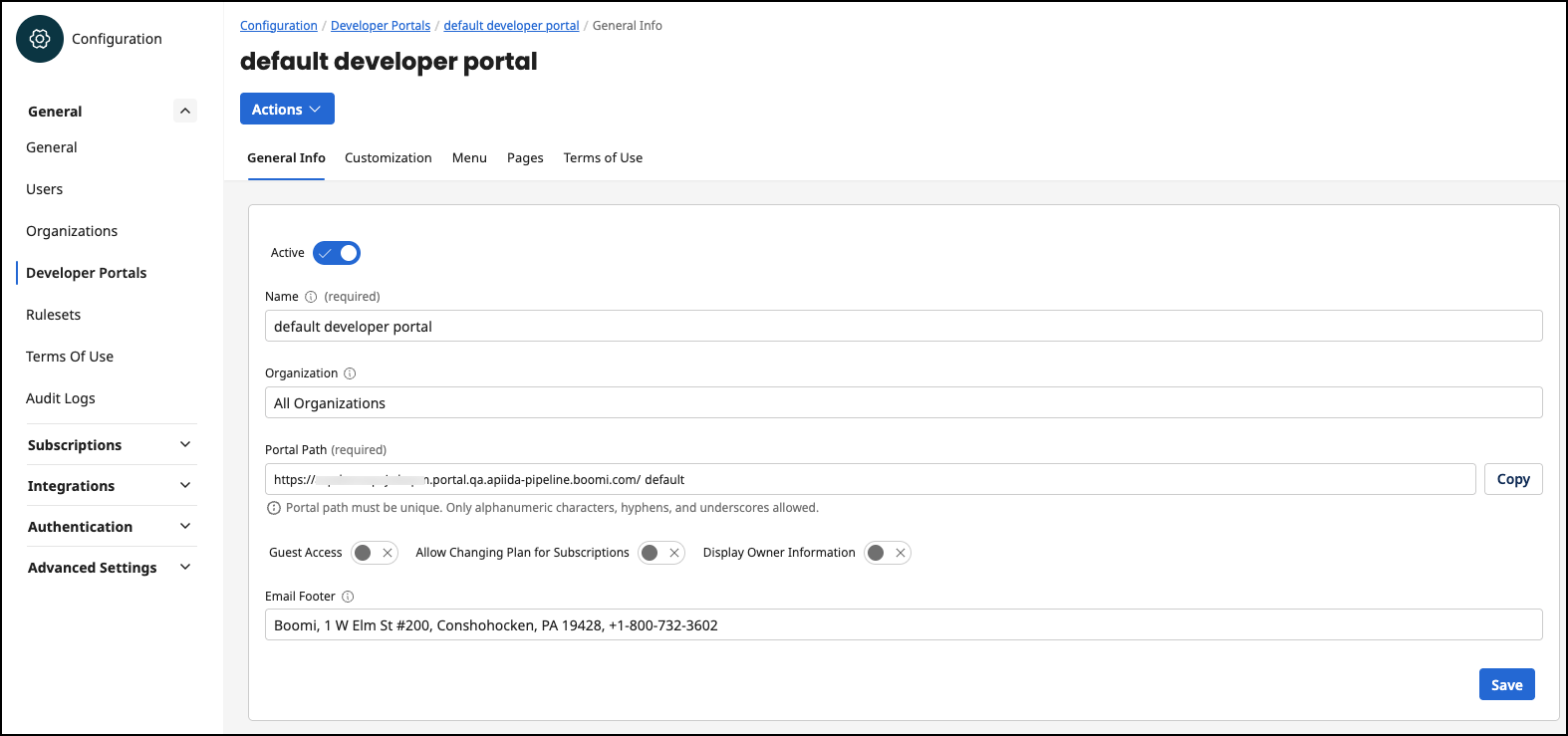
If you select one of the developer portals from the table, you can view and edit details about the developer portal on the General Info tab. You can delete the Developer Portal via the Actions menu.
-
Status - Active or Disabled. A disabled Developer Portal is no longer accessible at the specified URL.
-
Name - The name of the Developer Portal is displayed in the login screen.
-
Organization - If the organization is set for a Developer Portal, this Developer Portal is exclusive for this organization and has e.g. an impact on the visibility of APIs.
-
Portal Path (Boomi-managed developer portals only) - The URL of the Developer Portal. The default Developer Portal URL is
https://<tenantID>.portal.na.controlplane.boomi.com/default -
URL (Self-managed developer portals only) - The URL of the developer portal.
-
Developer Portal Token (Self-managed developer portals only) - A unique token you define that identifies the developer portal. Only alphanumeric characters, hyphens, and underscores are allowed.
-
Guest Access - You can enable or disable the guest access in the Developer Portal.
- If the option is disabled, a user must log in. Except for the login screen, there is no function for users who are not logged in.
- If the option is enabled, users can access the home page and list of APIs of their Developer Portal without login. The list of available APIs in guest mode is composed of all 'published' APIs that have the visibility setting 'Public'. Furthermore, Guests can register in their Developer Portal to subscribe to APIs.
-
Allow Changing Plan for Subscriptions - Allow users in the DevPortal to switch the plan of a subscription at a later date without having to delete and recreate the subscription. No approval request is triggered.
-
Display Owner Information - If this option is active, the owner information organization name and organization email is displayed in each overview of API and API product.
-
Email Footer - The footer of all emails sent by the developer portal. For example, an email is sent when a user is invited to the developer portal.
Customization
On the Customization tab, you can customize the general look and feel of the developer portal. The preview shown below gives you a first impression of how your customized developer portal will look.
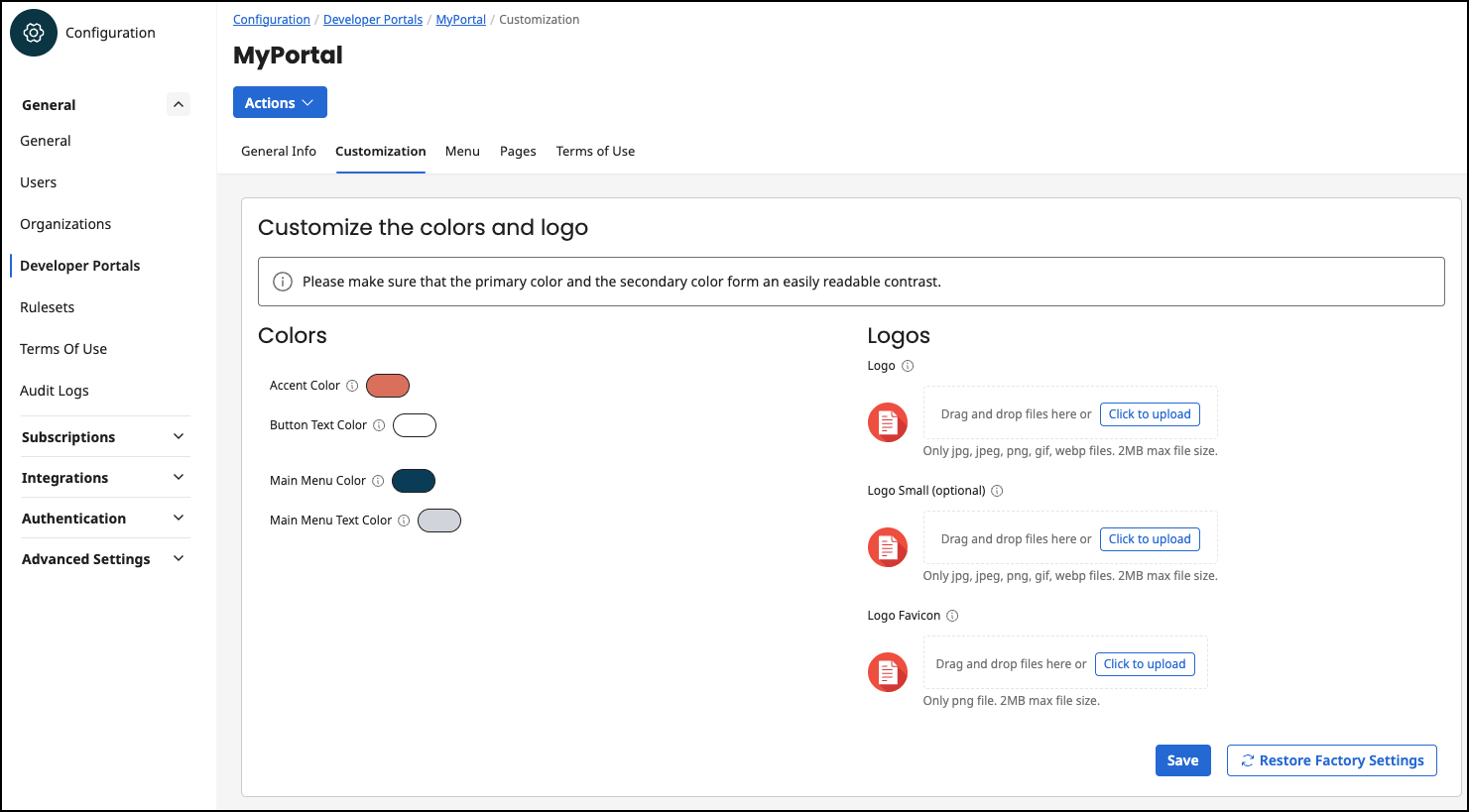
First, you can define your own color scheme. The following color schemes are available:
-
Accent Color
-
Button Text Color
-
Main Menu Color
-
Main Menu Text Color
You can also insert your own logos for your developer portal. You have the following logo options:
-
Logo - The logo is displayed in the login view. The logo can be up to 2 MB. Allowed image file types:
.jpg,.jpeg,.png,.gif,.webp. -
Logo Small - The small logo is displayed in the main menu bar at the top. If a small logo is not set, the normal logo is automatically used. The logo can be up to 2 MB. Allowed image file types:
.jpg,.jpeg,.png,.gif,.webp. -
Logo Favicon - The logo favicon is displayed in the browser as a favicon in the tabs. The logo can be up to 2 MB. Allowed image file type:
.png.
When you are finished with your custom settings, you must save them by clicking the Save button. The Restore Factory Settings option allows you to reset the colors and logos to the Boomi style.
Menu
On the third tab, Menu, you can create additional main menu items for your developer portal, determine their position, and who can view menu items. The menu items created here are displayed below the default menu.
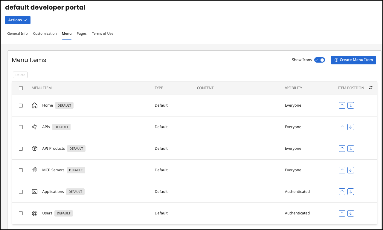
All customized menu items are listed in the menu table. The order in the table is the same as later in the developer portal. The table has the columns:
-
Menu Item: The name of the menu item with the selected icon.
-
Type: An item can only have one of the following types:
-
URL: A URL with valid protocol information, such as
https://www.boomi.com -
Page: A default page or a previously created page from the Pages tab.
-
Default: A default page.
-
-
Content: If the type of the item is URL, then the content contains the URL. If the type is Page, the page name is displayed.
-
Visibility The following options are available:
-
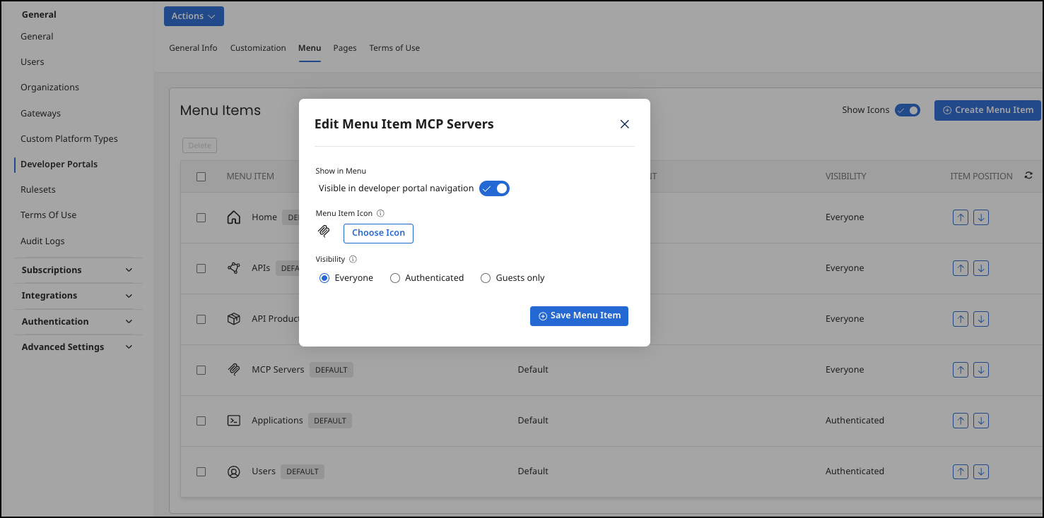
Show in Menu Visible in developer portal navigation - If enabled, the menu item displays in the left side menu navigation in the developer portal. The image below shows the default developer portal menu items.
noteThe Home option cannot be disabled and is always visible to Everyone.
-
Menu Item Icon - The image that displays next to the menu item in the developer portal.
-
Visibility
- Everyone - All users can view the menu item.
- Authenticated - Only logged in users can view the menu item.
- Guests only - Only visitors that are not logged in can view the menu item.
-
Item Position: This column contains two buttons that can be used to change the position of the item in the table.
If you select an entry from the table and click on it, an editing dialogue opens. In this dialogue, you can edit the individual data fields from the creation of an item (see below).
When creating a new item, first select if it refers to an external page (e.g. https://www.boomi.com) or an internal page. You can manage the internal pages under the fourth tab item Pages. You also assign a name and an icon to the new menu item.
Finally, depending on the type, select an internal page or enter a link to an external page. The internal pages are divided into default and custom pages.
Pages
On the fourth tab, Pages, you can view all existing default and custom pages. Default pages are placeholders on predefined pages. The name of a default page indicates on which predefined page it is used. The page is always displayed at the top of the predefined page. A default page cannot be deleted.
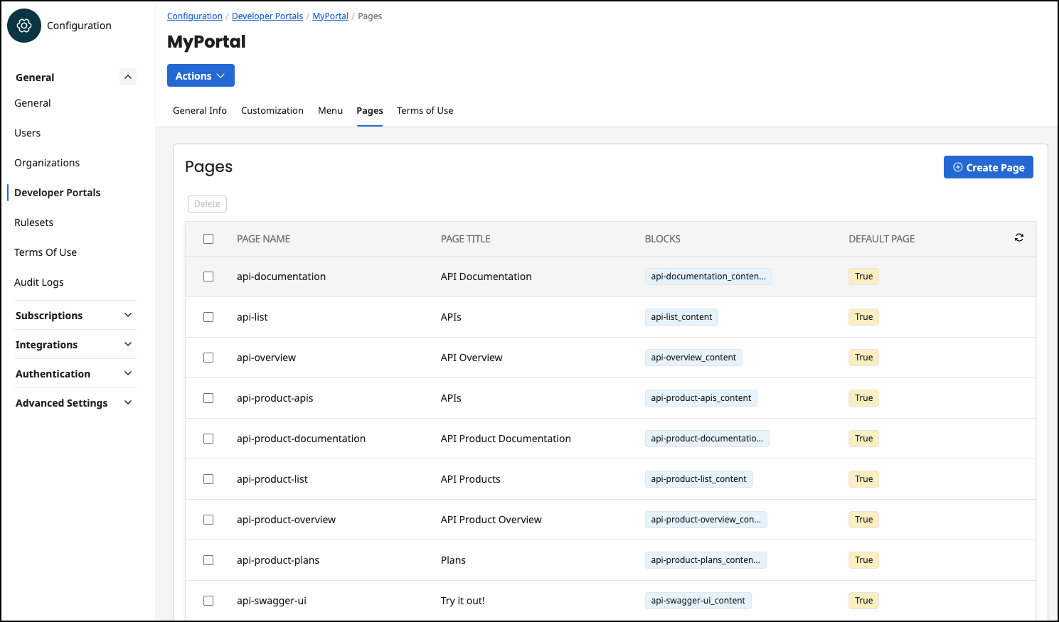
Within this menu item is the Pages table, which lists all default pages and custom pages. This table has the following columns:
-
Page Name: The technical name of a page which must be unique. This is used to identify the page.
-
Page Title: The title of the page is displayed in the developer portal in the header of the page.
-
Blocks: The blocks contained in the page.
-
Default Page: This column indicates whether a page is a default page, true, or a custom page, false.
If you select an entry from the table and click on it, an editing dialogue opens. In this dialogue, you can edit the individual data fields from the creation of an item (see below). In addition, you get the information which blocks are available in the page:
- Blocks in Page: A page can contain no blocks, one block, or multiple blocks. Blocks can be added to a page in the Developer Portal. Blocks contain the actual page content (html code).
To create a customized page, click on the Create New Page button. A dialogue with the following input fields appears:
-
Page Name: The page name must be unique, because it is used to identify the page. A page can be added to one or more menu items.The name cannot be changed afterwards.
-
Page Title: The page title is displayed in the Developer Portal in the header section of the web page. This title is selectable and can be changed.
Terms of Use
On the fifth tab, Terms of use, you can view and manage all terms of use for the Developer Portal.
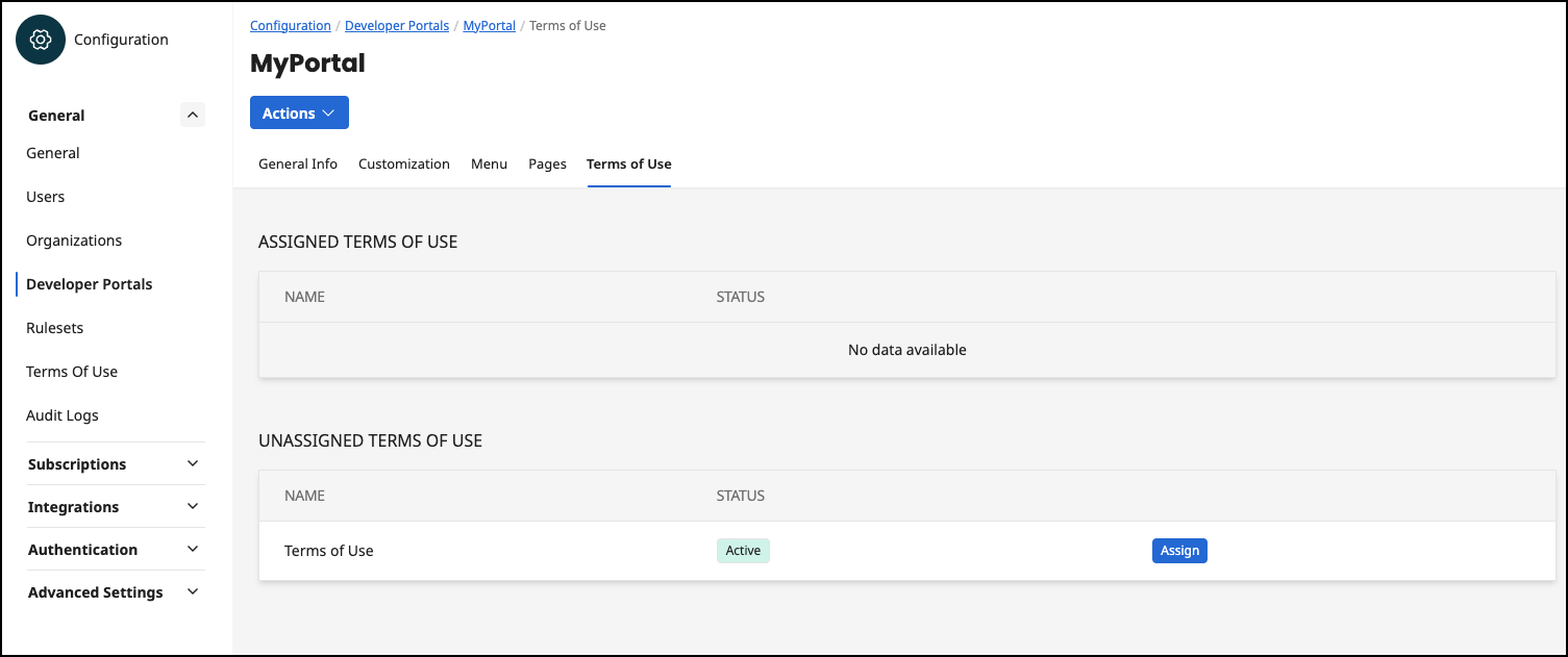
The terms of use assigned here are displayed to a new registered user before the password is set. The user must agree to these terms of use in order to gain access to the Developer Portal. The terms of use are managed here: Configuration Terms of Use
The first table Assigned Terms Of Use shows all assigned terms of use for the selected developer portal. The table has the columns:
-
Name: The name of the term of use.
-
Status: The status of the term of use, which can be active or inactive.
-
Actions: This column does not remove a title. Here you can have a button to unassign the term of use or the information 'default'. If the value default is displayed, it has been decided within the term of use that this is active for all developer columns (see Configuration Terms of Use | Settings)
In the second table Unassigned Terms Of Use, all unassigned terms of use are displayed, which could be added to this developer portal. The table has the same columns as the first table, only the last column of the table can only contain an Assign button. This button is used to add the selected term of use to the developer portal.
